Outcome
Merchant adoption of rule-based routing within 1 month of going live.
Reduced steps from 3 to 1, saving time & reducing merchant drop-offs.
New merchants onboarded - bringing the total number of partners to 33.
Redesigning BoxPay’s payment routing to match real-world merchants needs.

Team
Product Designer (Me)
2 Product Managers
Chief Product Officer
Chief Technology Officer
1 Frontend Developer
1 SDE
1 QA Tester
My Role
Overview
BoxPay Technologies is a payment orchestration platform for e-commerce merchants. In every sales pitch, they talk about three things: Reach, Routing and Reconciliation. Routing decides which gateway each transaction goes through, based on things like fees, currency and success rate.
Duration
3 months (Sep 24 to Nov 24)

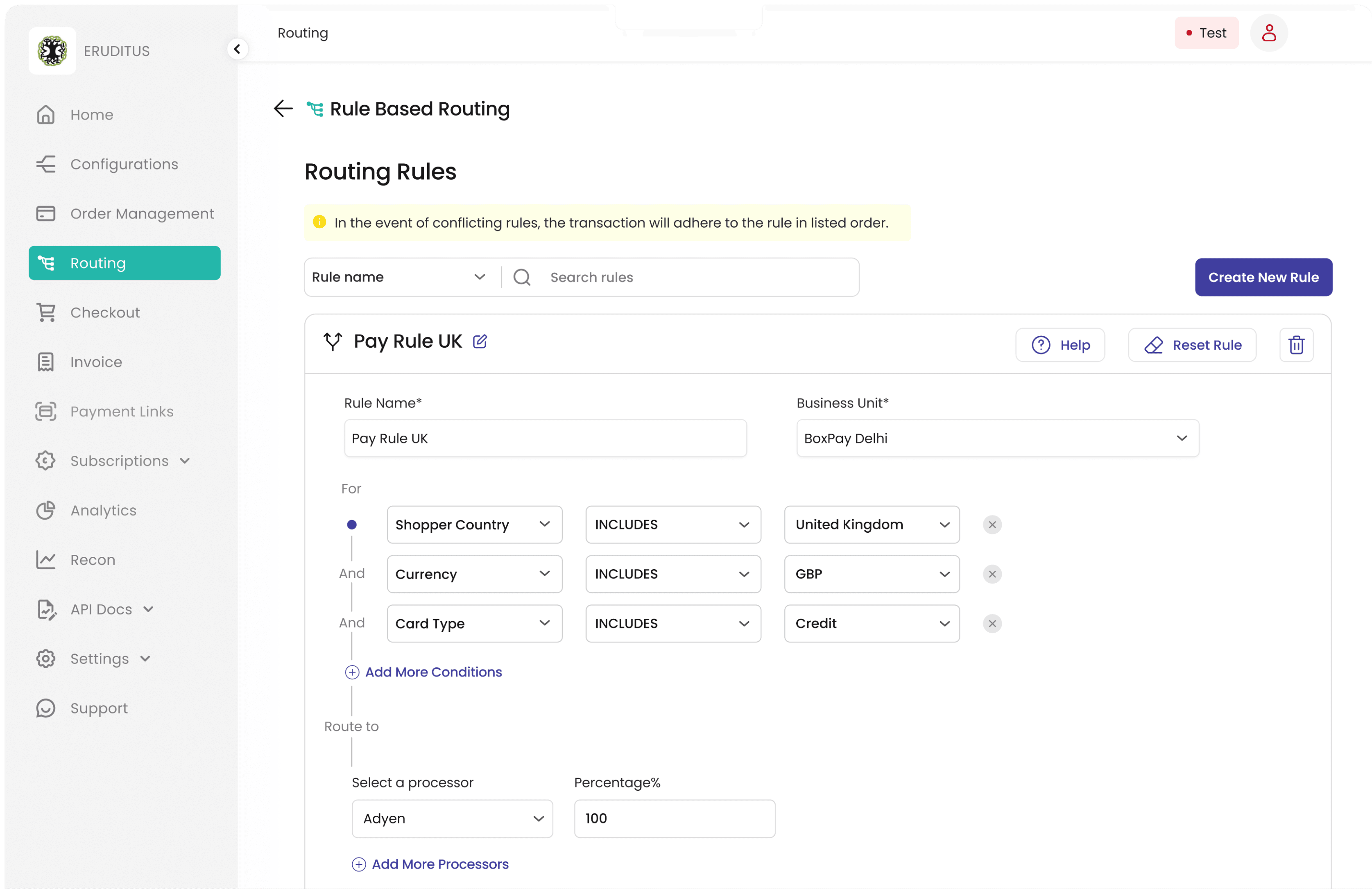
When I went through the PRD and the live feature, the core gap was easy to see. A merchant could route "cards" in general, but couldn't route credit cards issued by HDFC specifically. That lack of granularity was the real problem.
The Ask
Rebuild routing so merchants get full control over their logic, without needing a technical team to set it up.
The routing feature had been live since day one, but it was built only to work. As merchants grew across countries and gateways, it started getting in the way of their operations and their revenue.
Where it started
Fig. 1.3. Website view of the old routing feature (live until 2024)
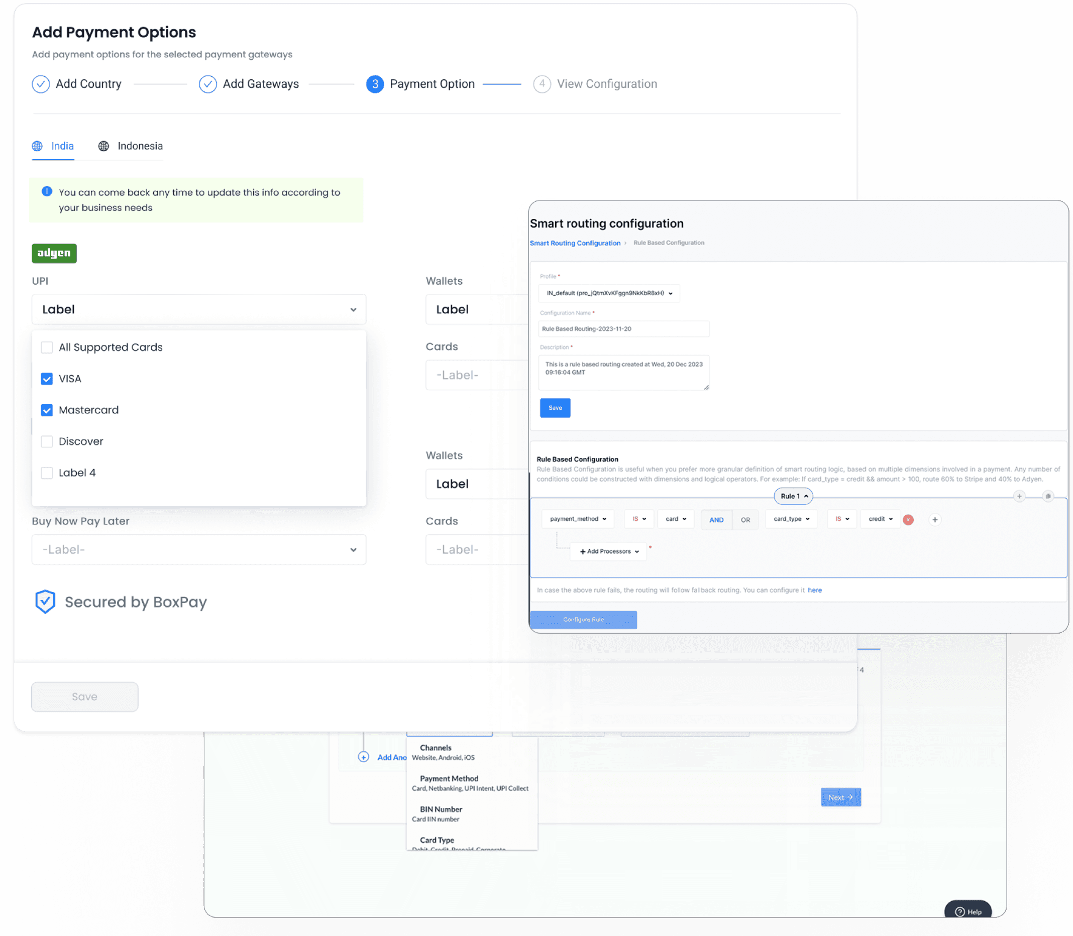
Fig. 2. How competitors do it.
Every platform I looked at used the same three steps. Name the rule, add the logic, then review it somewhere else.
They all assumed a technical user. Most of BoxPay's merchants are small teams with no developer on hand, and they were the ones who needed this most.
So I set one rule for myself early on. Not every interface needs to feel like flying a plane.
Competitor’s Design Stalking (Professionally, of course)
Refining Through Iteration
Incorporating the suggestions, I refined the design to create this improved version.
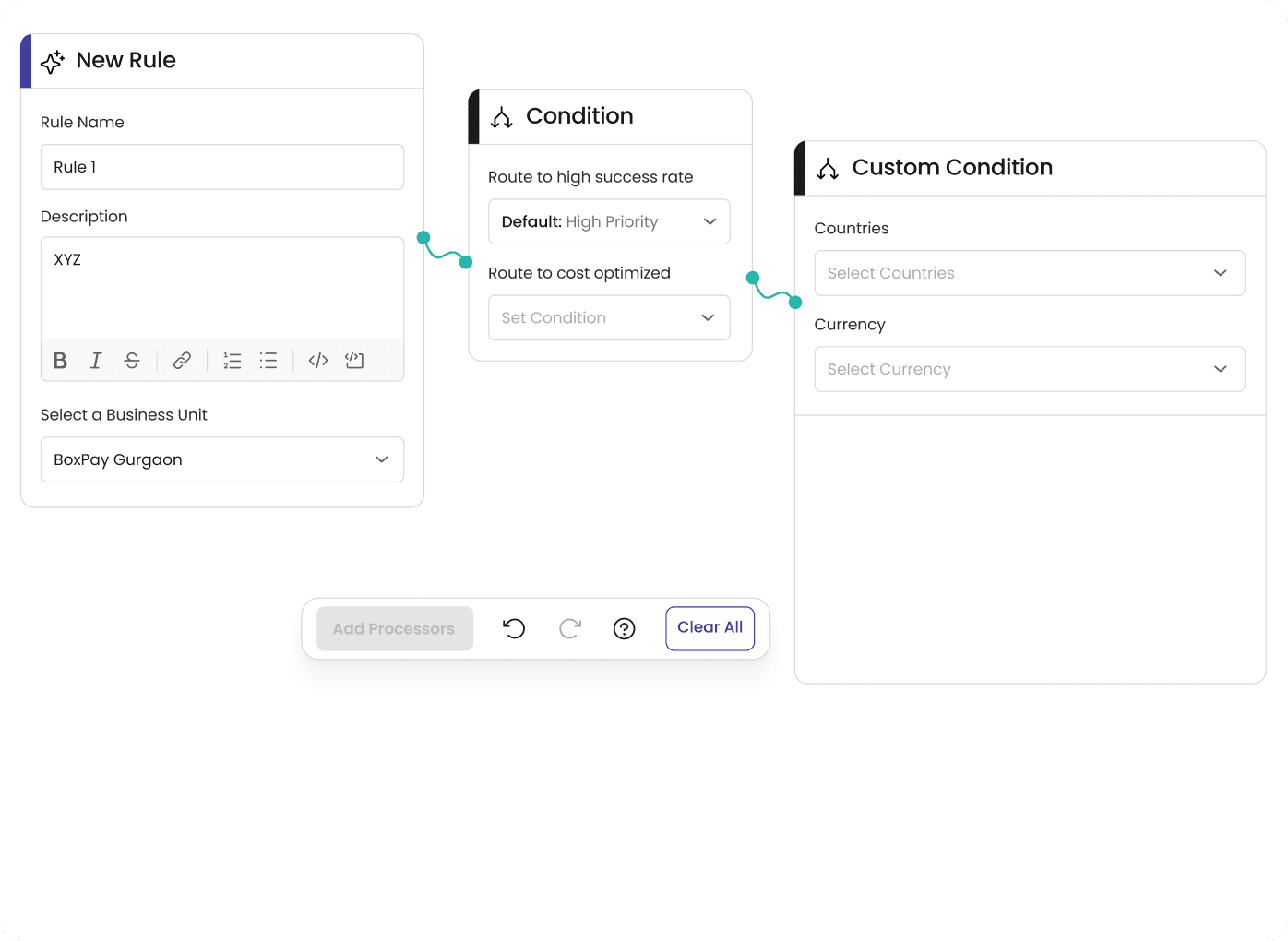
Designing the core: ‘Rule Workspace’
My first instinct was to go after the hardest use case first. That ate into our timeline fast. The PM helped me step back, and we switched to handling simple cases first and scaling up from there. I shared early versions with the PM for logic, the frontend devs for feasibility, and the CPO for direction.
The workspace is where merchants define conditions and pick gateways, so I started there. Before sketching anything, I sat with the PM to clear up the vague use cases in the PRD and we rewrote parts of it.
Finalising the ‘Rule Workspace” look
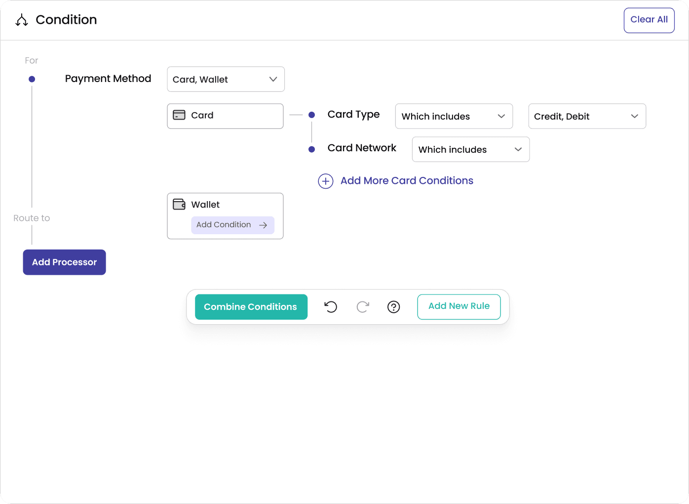
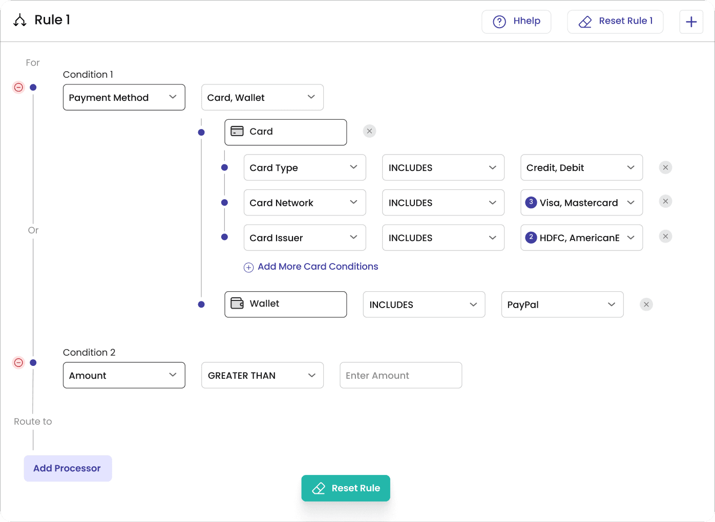
Each design pass uncovered something new. Slowly but surely, clarity emerged:
One Smart Condition
The original routing design required merchants to input all four fields. This was rigid. So, I redesigned it with - One smart condition field, allowing users to define only what mattered.
Users have the freedom to create rules in whichever order suits their needs.
Applying Progressive Disclosure & Law of Proximity
To reduce cognitive load, I used progressive disclosure, showing one field at a time, revealing the next based on user input.
Related conditions were grouped horizontally to visually signal their connection.
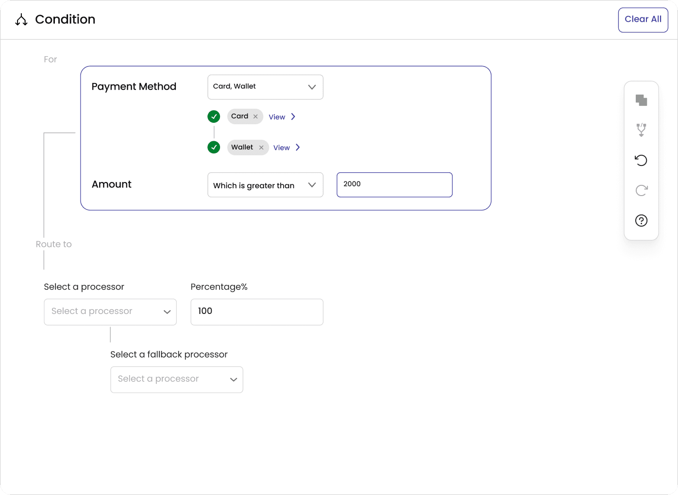
Choose Multiple Processors With Ease
Users can now effortlessly select multiple partnered payment gateways and distribute daily transaction volumes with ease.
Key aspects of the redesigned Rule Workspace:
Video. 1. Prototype of the Rule Workspace Design



I still had the three-step flow in my head and couldn't figure out how to collapse it.
✏️ Add a rule name and description
🧩 Define logic and assign a payment gateway
💾 Review and save the rule in a separate table
Each rule minimises into a quick snapshot with an expandable chevron, making it easy to scan, edit, or revisit. No tab-hopping, no fragmented views, just one continuous, scrollable space that keeps everything tidy, intuitive, and in context.
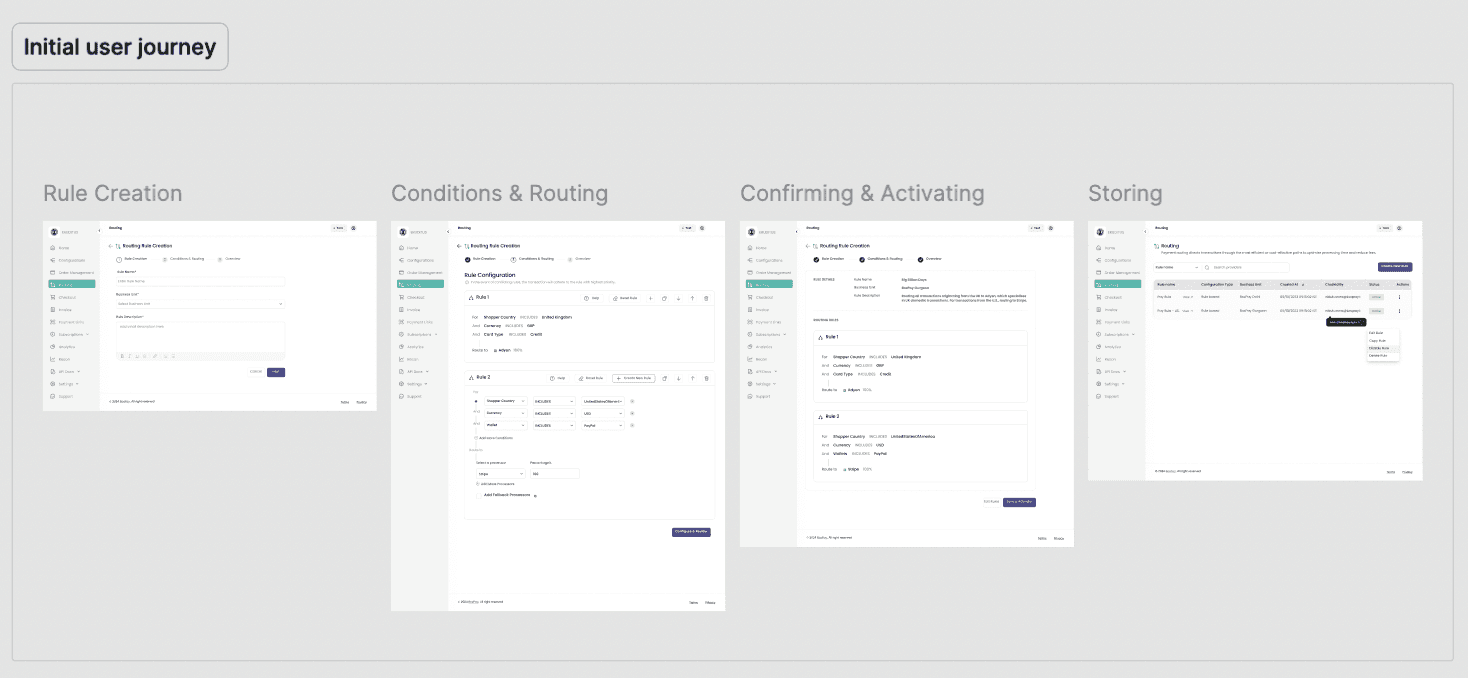
Fig. 6.1. Initial approach – generic user flow found in most competitor products
💡💡💡
Then, a few days in, I was writing an email in Gmail and noticed how the compose window opens right inside the inbox, and how each new mail just stacks on top of the last one.
So I tried the same thing with rules. You create a rule right where you are. When you're done, it folds into a compact card and stacks with the others. Need another one? Hit "Create New Rule" and a fresh workspace drops in below.

Inspiration from Gmail’s smart compose
The first round was with our sales team, who aren't technical. They found it easy to follow, and the devs confirmed most of it could be built without much overhead.
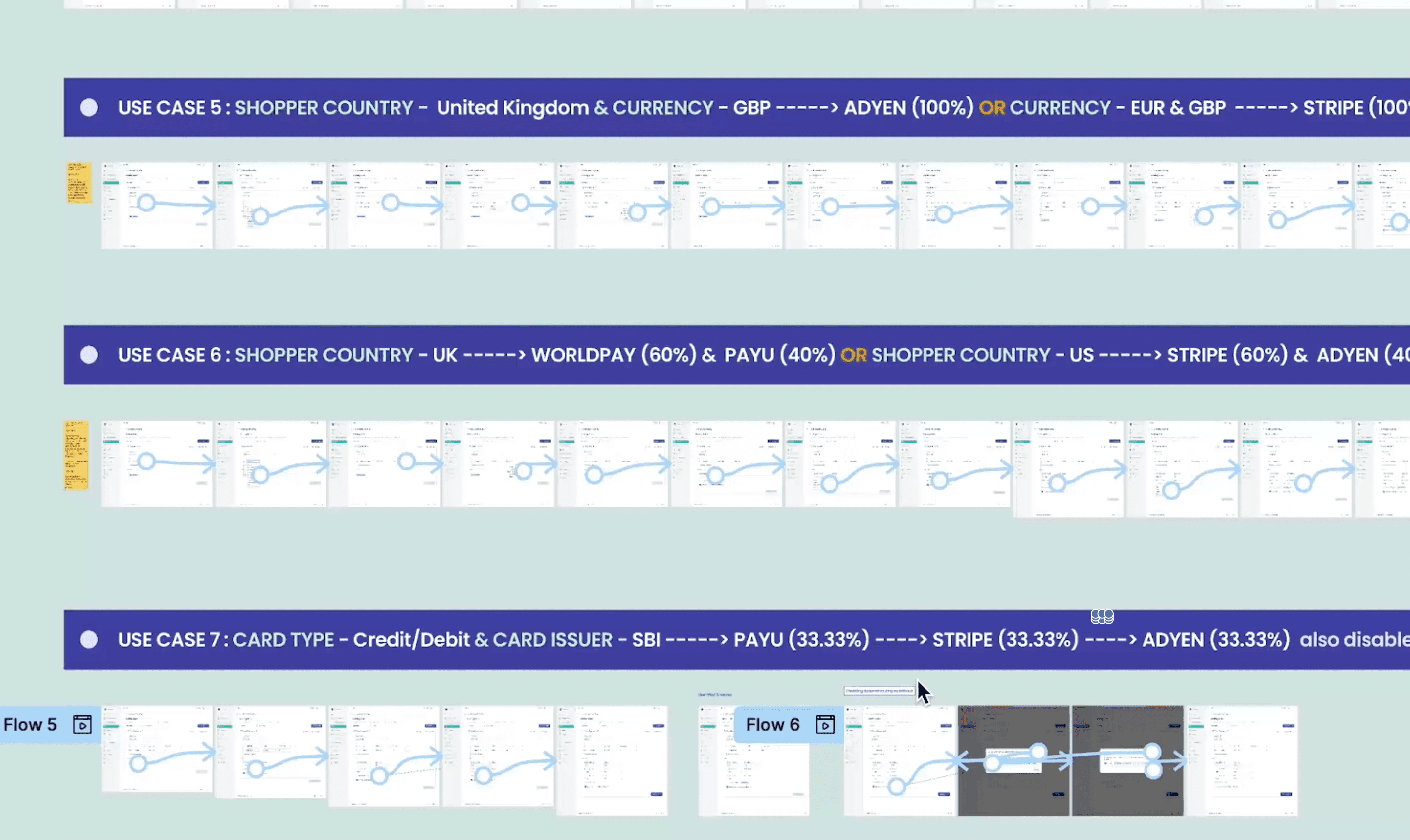
Then in the product workshop, the CPO asked whether this would hold up against the edge cases our merchants actually deal with. He and the PM listed 13 real scenarios, including BIN-specific card routing, discounts by card network or issuing bank, multi-currency flows, and region-based fallbacks. I ran every one of them through the prototype.
At the same time I ran a scavenger hunt test. Each use case became a task, and I watched whether people could find the entry point, follow the flow and finish without help.
One thing kept tripping people up. They couldn't find the inline field for naming a rule. After a quick sync with the devs, we pulled the name out into its own visible input and mirrored it in the card header. On the retest, the problem was gone.
BEFORE

Fig. 5.1. Inline field creating friction in task completion
AFTER
Fig. 5.2. The solution – separating the name input and mirroring it in the header
Full walkthrough of the final routing flow
Development took three weeks. I worked with the frontend and QA teams through the build and flagged a few small UI issues, which were fixed during handoff. The last round of testing included internal teams, a few merchants and some friends and family, and people genuinely liked using it. It then went to the sandbox for real-world testing.
Even before full-scale launch, early indicators pointed to strong adoption and usability wins:
✅ 13/13 use cases passed using the new interface (including complex routing conditions with BIN, network, and card-type logic)
✅ 80% success rate in first-time usability tests with non-technical users. Supported advanced logic, yet stayed simple for all user types
✅ Consistent feedback from stakeholders: “Feels intuitive just like creating a Gmail filter.”
✅ Reduced steps from 3 to 1, saving time and reducing merchant drop-offs
✅ 48% Merchant adoption of rule-based routing within 1 month of going live.
✅ Presenting this feature to potential clients helped onboard 2 new merchants, bringing the total number of partners to 33.
What happened next
The journey of building this feature came with a few unexpected (but valuable) lessons:
👉🏻 Inspiration doesn’t always strike in brainstorming sessions. Sometimes, it arrives in your inbox, mid-email and with time.
👉🏻 The KISS (Keep it Simple, Stupid) rule is gold. Not to try to build a spaceship when a bicycle will do to get started. Designing from simplicity gave me the clarity I needed to scale smarter.
👉🏻 People from different roles, sales, devs, friends outside tech, all brought in fresh perspectives. The more conversations I had, the sharper the design became.
While we kept the scope limited to a lean Version 1 to measure response and usability, we already had a few exciting enhancements on the radar (check it out in the in-depth version).
What I took away